Double Floor House Front Design Ideas
The double floor house front is the workhorse of residential design — two storeys give architects real compositional material: stacked and shifted volumes, balconies, double-height entries and material changes between levels. The same height that offers drama also creates the classic two-storey traps: top-heavy massing, chaotic windows and the dreaded 'big flat wall' effect.
This guide collects two-storey front elevations from contemporary to classic, and explains the compositional rules that make them work — how to split materials between floors, when to project or recess the upper level, how to place balconies that get used, and how to handle the double-height entry without wasting energy or budget.
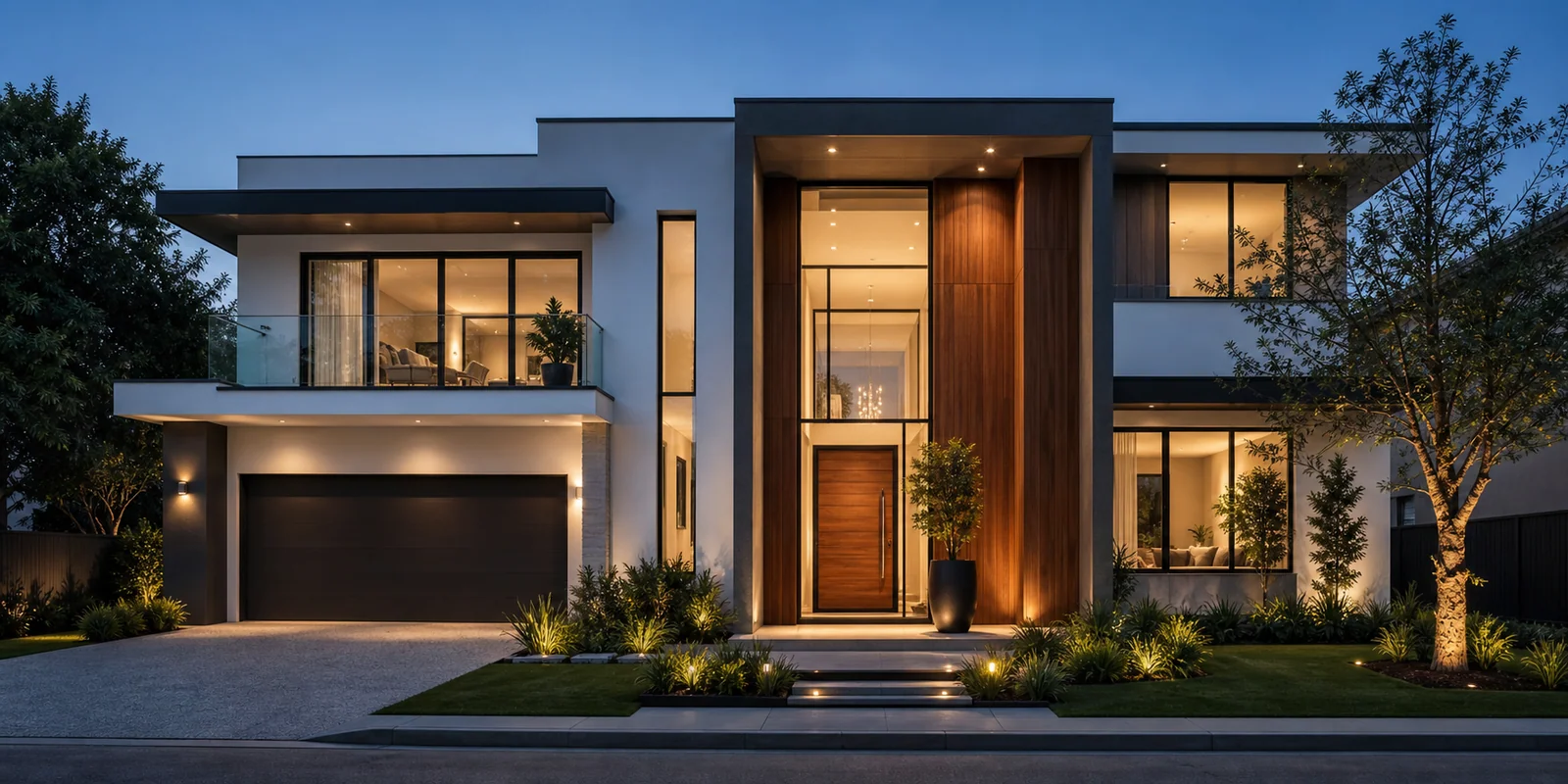
Double Floor House Front Design Gallery
Every image below is a unique AI-created design concept. Love one? Use its caption as a starting prompt in our free AI generator and make it yours.
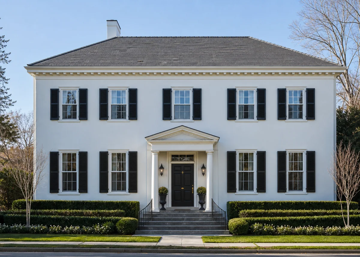
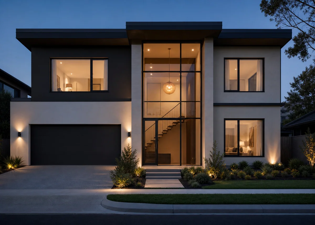
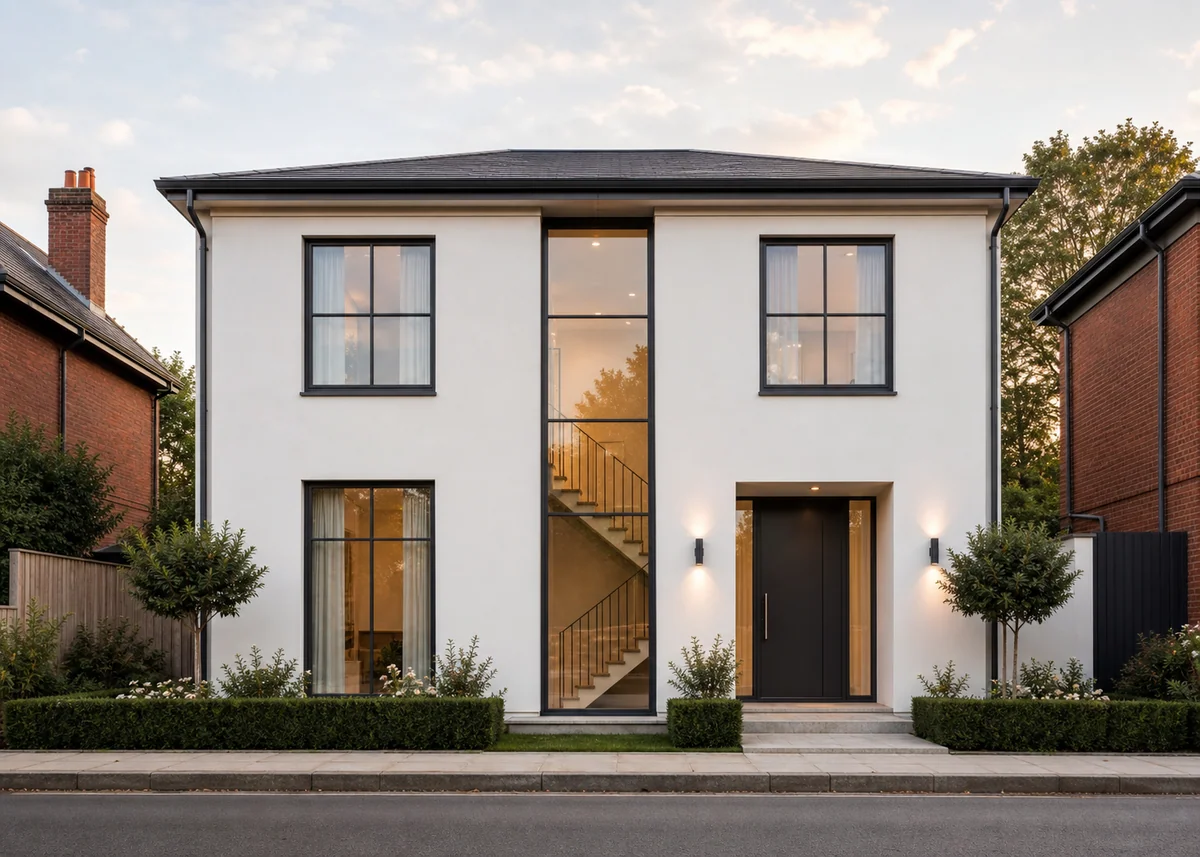
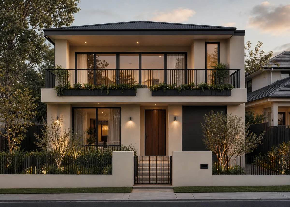
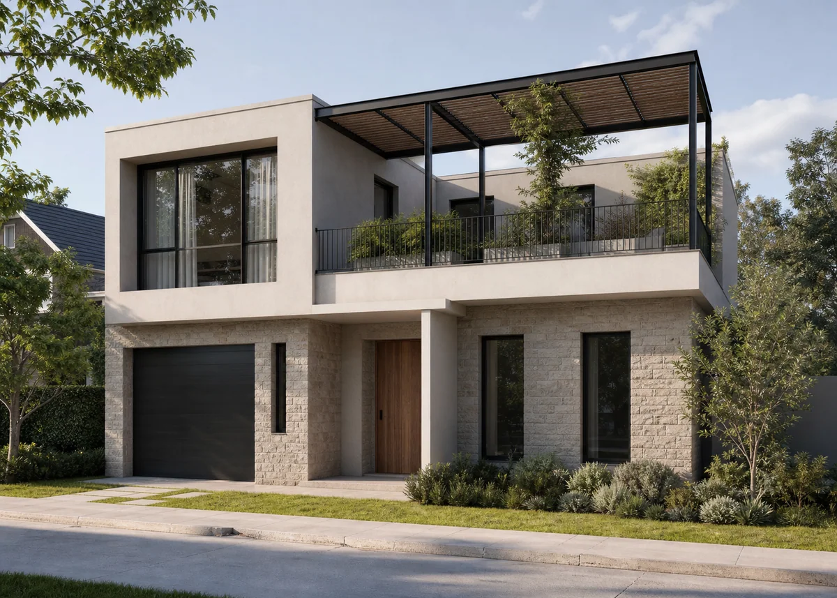
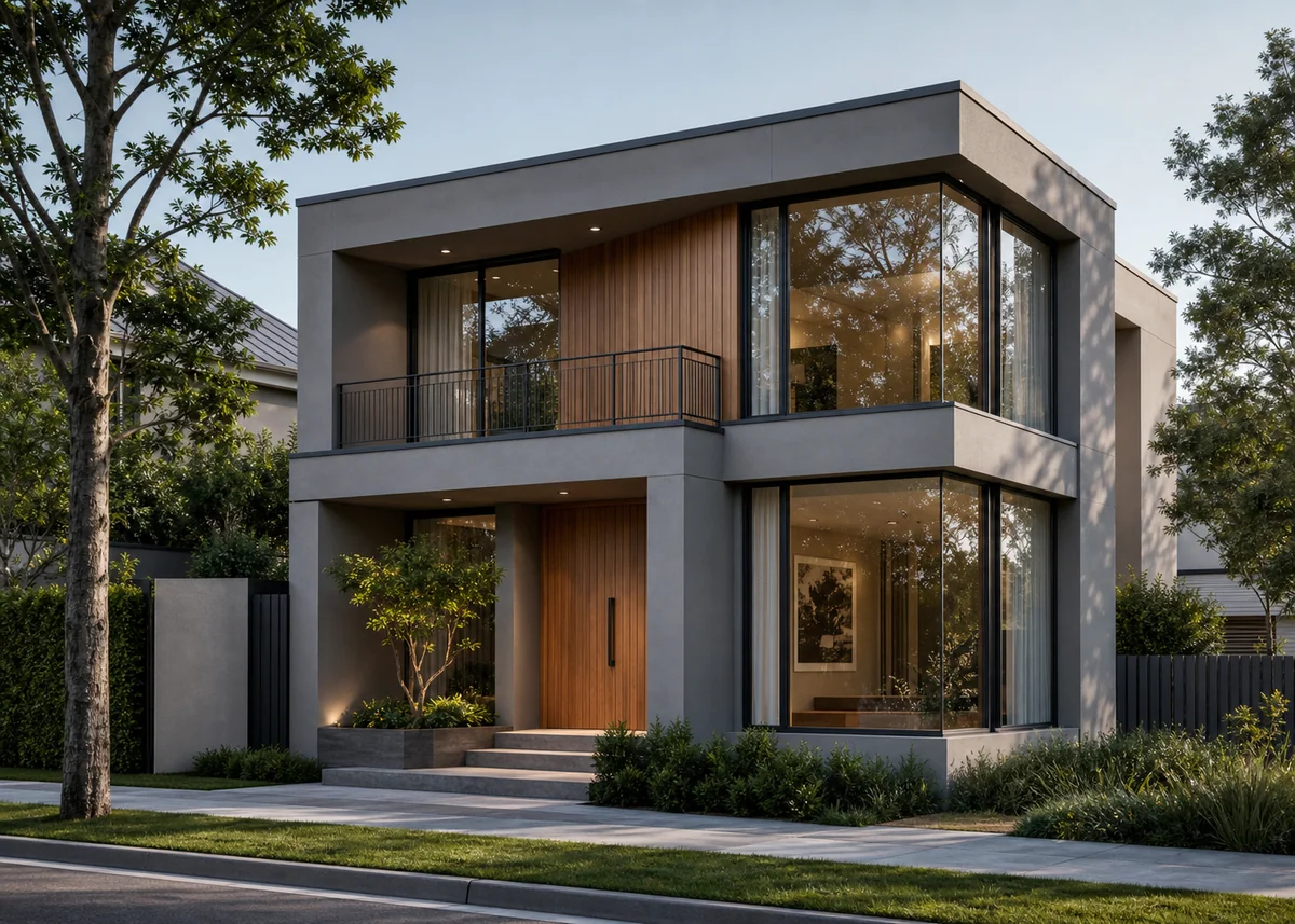
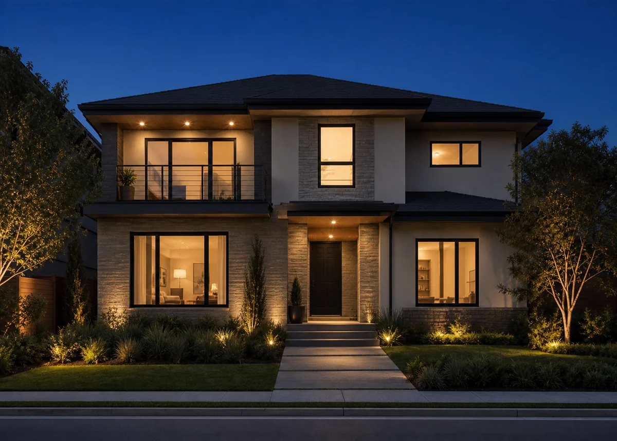
Design your own double floor front
Describe your plot, materials and style — our AI turns it into a photorealistic concept in seconds.
Massing: Stack, Shift or Carve
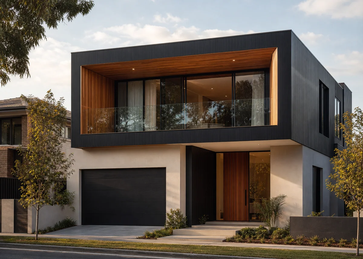
Two-storey fronts succeed by manipulating the upper volume. Stack it flush for classical calm (then rely on windows and materials for interest); shift it — cantilevering a metre forward or setting it back to create a terrace — for contemporary drama; or carve into the mass with a recessed balcony or double-height entry void that punctures the box.
Whichever strategy you choose, give the facade one dominant move, not three. A cantilever plus a tower plus an angled wall reads restless; a single confident projection with everything else disciplined reads architectural. The most photographed two-storey homes are usually making exactly one bold gesture.
Splitting Materials Between Floors
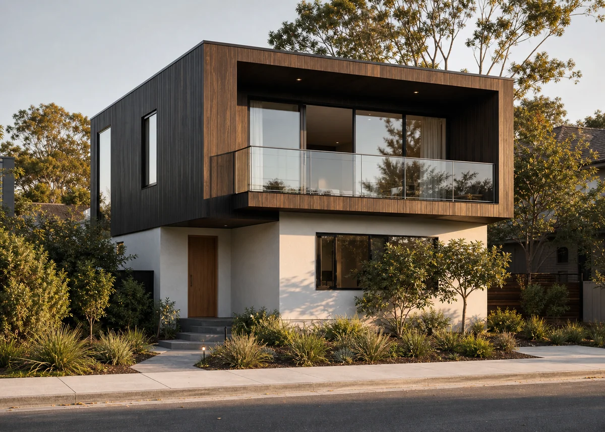
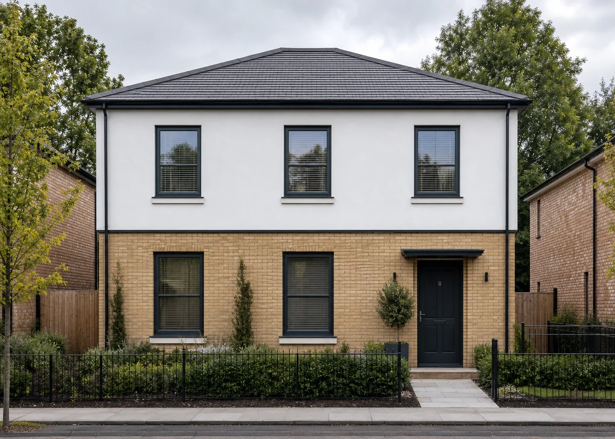
The two-storey facade's signature opportunity is the horizontal material split: heavier, darker or more textured below (brick, stone, dark render) with lighter or warmer above (white render, timber, fibre-cement) — or the modern inversion, a dark timber or metal box floating over a light glassy base. Land the junction exactly on the floor line, expressed with a shadow gap or slim band.
Keep the split ratio deliberate: 40/60 or 50/50 reads composed, while a thin strip of one material at the top looks like the budget ran out. Repeat each material at least once elsewhere — gate, boundary pier, garden wall — so the palette feels designed rather than assembled.
Balconies That Earn Their Place
A balcony transforms a two-storey front — when it's real. Design for use: 1.5 metres minimum depth (enough for chairs), access from a bedroom or family room, and orientation that catches morning or evening comfort. Decorative 300mm 'Juliet strips' bolted across windows add clutter, not value; a glazed Juliet balustrade behind full-height doors is the cleaner slim option.
Railing choice sets the style: frameless or channel-set glass for modern transparency, vertical steel bars for crisp contemporary, timber slats for warmth, moulded masonry for classical fronts. Recessed balconies — carved into the volume rather than hung off it — cost more structurally but deliver shade, privacy and the deepest shadow on the facade.
Window Discipline Across Two Floors
The fastest way to ruin a double floor elevation is windows scattered per-room with no elevation logic. Establish vertical alignment — upper windows over lower ones or over the door — and a shared head height per floor. Where the plan forces an offset, group the stragglers into a boxed frame or cladding panel so they read as one composed element.
Exploit the two-storey format's unique options: a stacked pair united by one recessed frame, a vertical slot running both floors at the stair, or a corner window turning the volume at each level. These moves give height-appropriate drama that single-storey homes simply can't perform.
The Double-Height Entry Question
A double-height entry void — glazing rising two storeys beside the door — is the two-storey facade's most desired feature, and it works when it's honest: lighting a real stair or gallery hall behind. As pure street theatre with an empty air-conditioned void behind, it wastes energy and floor area; a generous single-height entry with a deep canopy often serves better.
If you build one, detail it properly: slim mullions or frameless glazing, a feature pendant visible through the glass at night, and solar control (orientation, fritting or recessing) so the void doesn't become a heat chimney. The glowing two-storey lantern at dusk is the payoff that justifies the engineering.
Proportion, Roof and the Street
Guard against top-heaviness: the upper floor should never read as the taller storey, and parapets or roofs should cap the composition with restraint. On pitched-roof designs, aligning the eave with the upper window heads keeps the wall-to-roof ratio calm; on parapet designs, a 600–900mm parapet above the upper slab is usually enough.
Respect the streetscape: match neighbouring setbacks and approximate eave heights where possible, and put the boldest massing moves on the entry side rather than looming over a neighbour's garden. A two-storey house that nods to its context reads confident; one that ignores it reads intrusive — and planning authorities agree.
Frequently Asked Questions
How do I make a double floor elevation look modern?+
One bold massing move (cantilever, recess or set-back terrace), a clean material split landing on the floor line, aligned windows with consistent dark frames, and a glass or vertical-bar balcony. Restraint everywhere else.
Which material combination works best for two floors?+
Heavier below, lighter above: brick or stone base with render or timber upper. The modern inversion — dark box over light glassy base — is equally strong. Land junctions on the floor line and keep ratios near 40/60 or 50/50.
Is a double-height entry worth it?+
Yes when it lights a real stair or gallery behind the glass; no as empty theatrical volume — that wastes energy and area. If built, use slim frames, a visible feature pendant and proper solar control.
What balcony depth is actually usable?+
1.5 metres minimum for a pair of chairs; 2 metres for dining. Below 1 metre, choose an honest glazed Juliet balustrade instead of a token ledge.
How do I avoid the 'big flat wall' look?+
Break the plane with one projection or recess, split materials at the floor line, align and group windows, and add depth elements — canopy, balcony, deep reveals — that cast real shadows.
Should the upper floor match the neighbours' height?+
Approximately, yes. Matching setbacks and eave heights keeps the street coherent and planning approvals smoother. Spend your boldness on massing and materials, not on looming over the neighbourhood.